
Live-Streaming App
MinaLive was envisioned as an app made for the China live-streaming market, developed by Hello Pal Asia Ltd. It combines live-streaming and social media features, allowing users to connect and share experiences in real-time.

Overview
Based on the Hello Pal app, I designed MinaLive to better serve Chinese users, resulting in a culture-first UI that prioritizes vibrancy and community interaction
As the Visual Design Lead, I synthesized stakeholder research and competitive benchmarks into a production-ready design system, delivering the project one week ahead of schedule.
Year
2024
My Role
Visual Design Lead
Tools
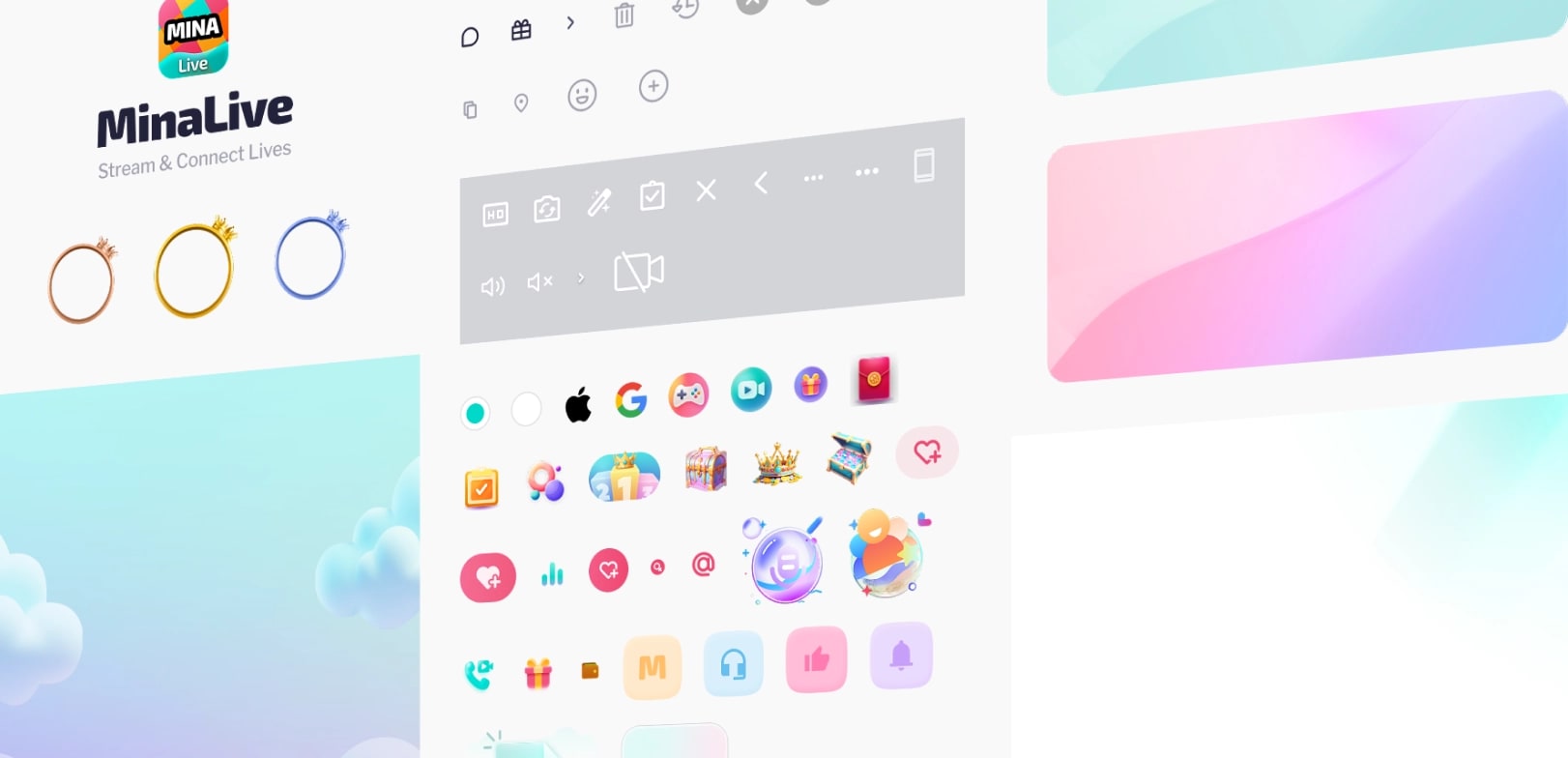
Figma, Zeplin, Leonardo AI, Illustration
Problem
Cultural Friction
The existing Hello Pal app failed to resonate with the local Chinese market due to the platform being too foreign and crowded.
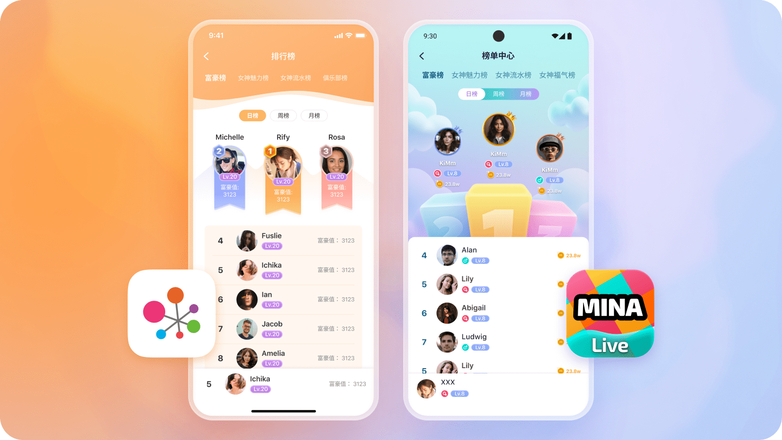
Hello Pal vs. MinaLive Ranking Screens
Strategic Research Insights
Through user interviews, we identified three critical pain points:
Social Overcrowding
Analysis revealed that users felt the platform was oversaturated with non-Mandarin speakers, hindering local community growth.
Communication Barriers
A lack of localized moderation and Mandarin-focused chat rooms made it difficult for local users to engage meaningfully.
Visual Mismatch
Benchmarking showed that the Western minimalist UI lacked the "gamified feedback" (rewards/badges) that drives retention in the local market.
Solution
Culture-First Approach
I combined features from Hello Pal with engagement tools identified through competitive analysis of popular Chinese live-streaming apps.
Localized Aesthetics
Implemented a bold Teal primary palette and a high-density “card” layout to align with the mental models of users accustomed to information-rich Chinese social platforms.
Community Features
Integrated a "Moments" feed (similar to WeChat), to facilitate asynchronous social engagement, reducing the friction found in real-time-only interactions.
Engagement Systems
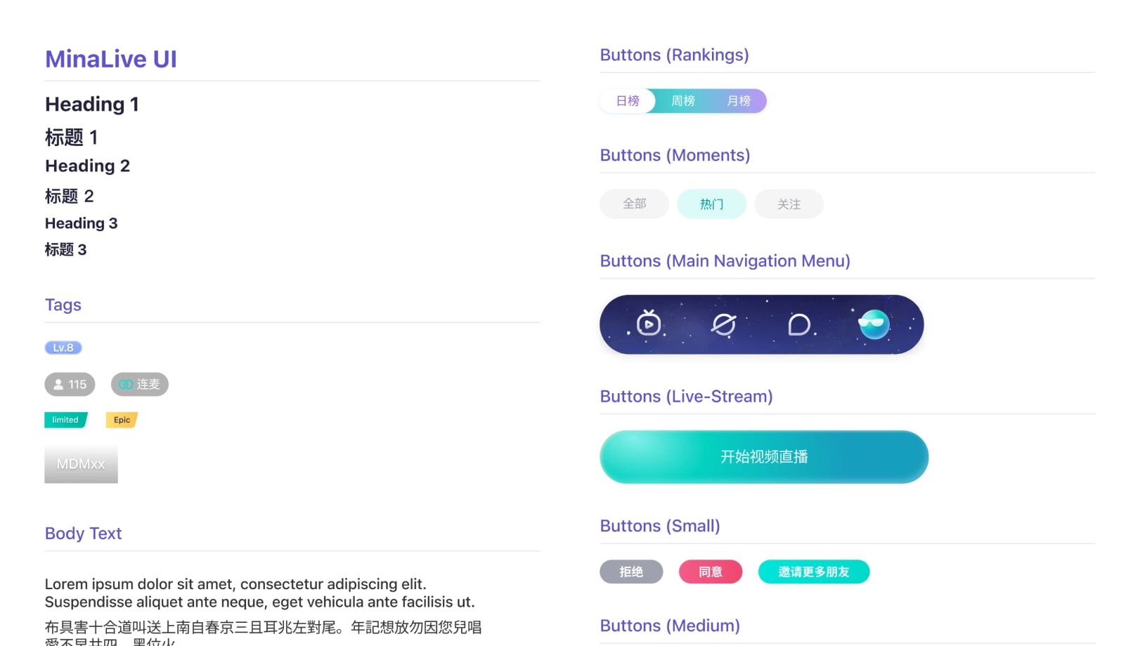
Integrated VIP badges, banners, and reward systems are features highly valued in Chinese UI/UX.
Process
Wireframes & Flow
I developed initial wireframes to outline user flows, refining them based on stakeholder feedback to ensure a smooth transition from broadcasting to chatting.
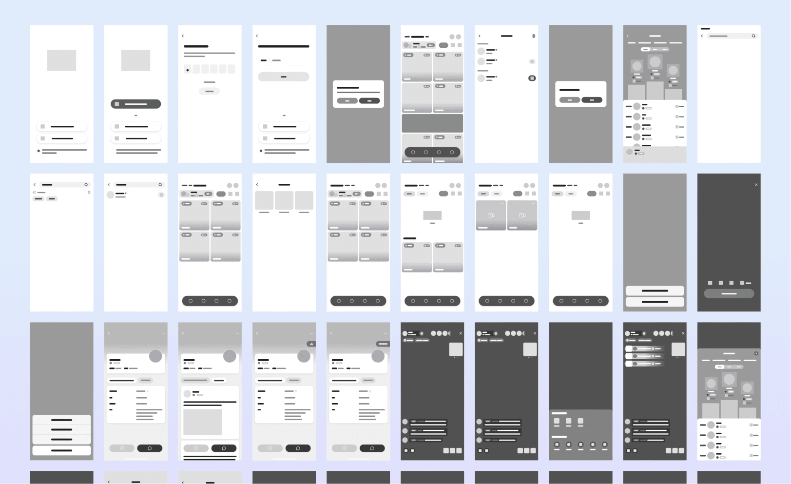
MinaLive Wireframes
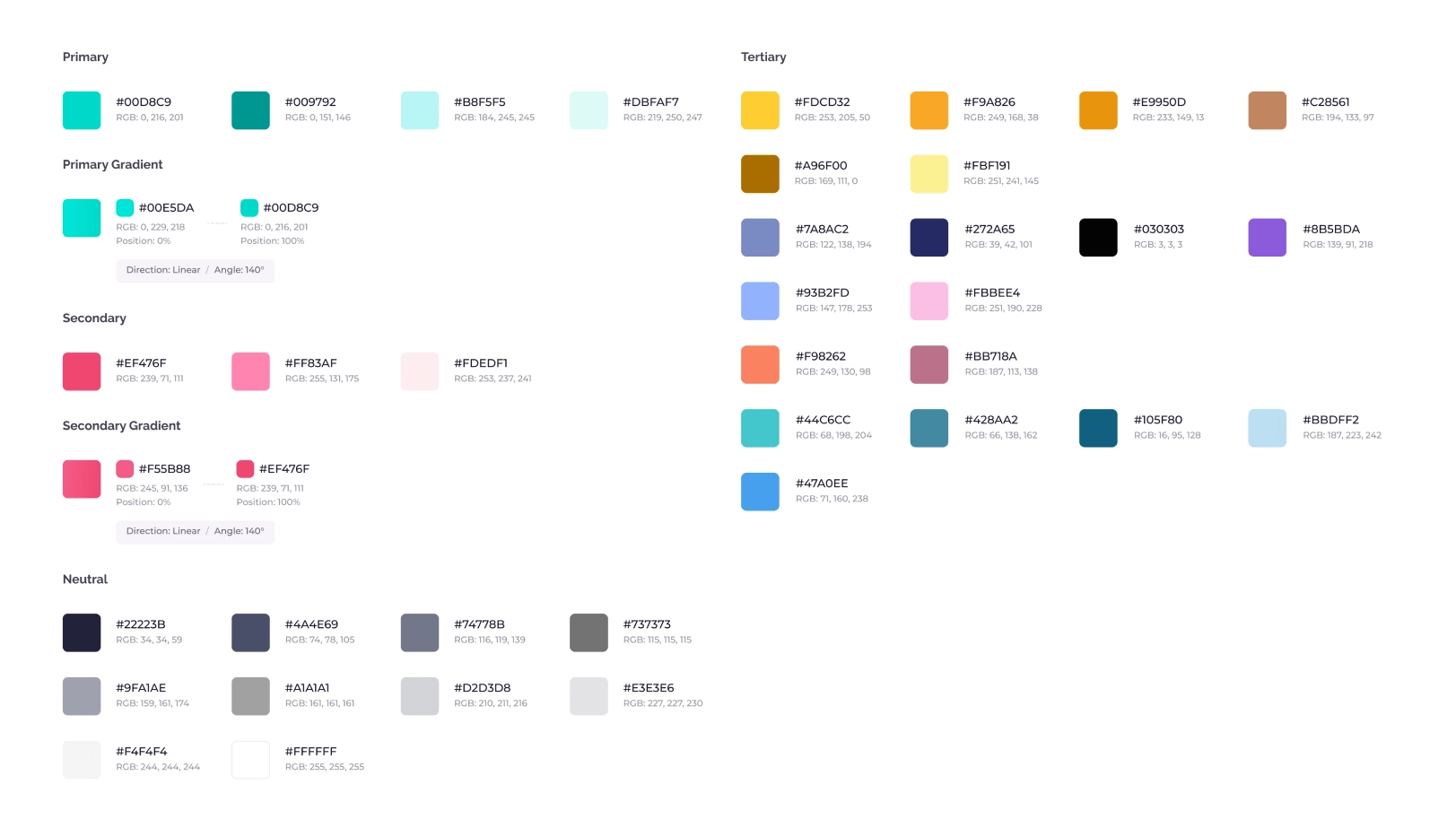
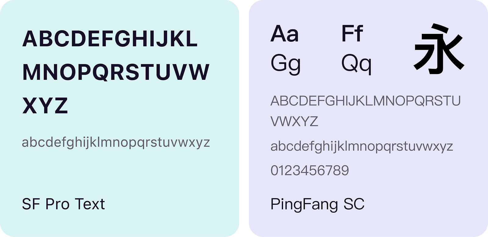
Visual Language
To ensure readability, I paired SF Pro Text for English with PingFang SC for Simplified Chinese. I established a cohesive design system centered around a primary Teal palette to maintain consistency for the development handoff.
Hi-Res Prototypes
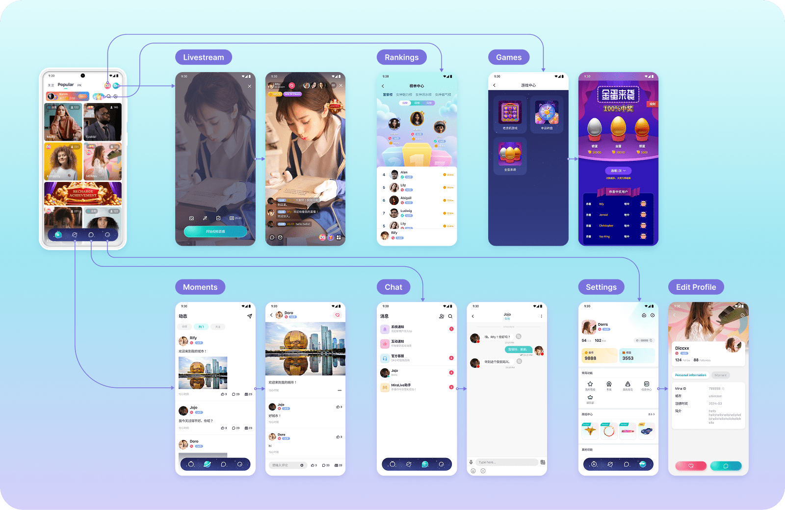
Through a process of iterative refinement, I designed comprehensive prototypes for each screen to evaluate navigation and functionality, building upon the initial wireframes.
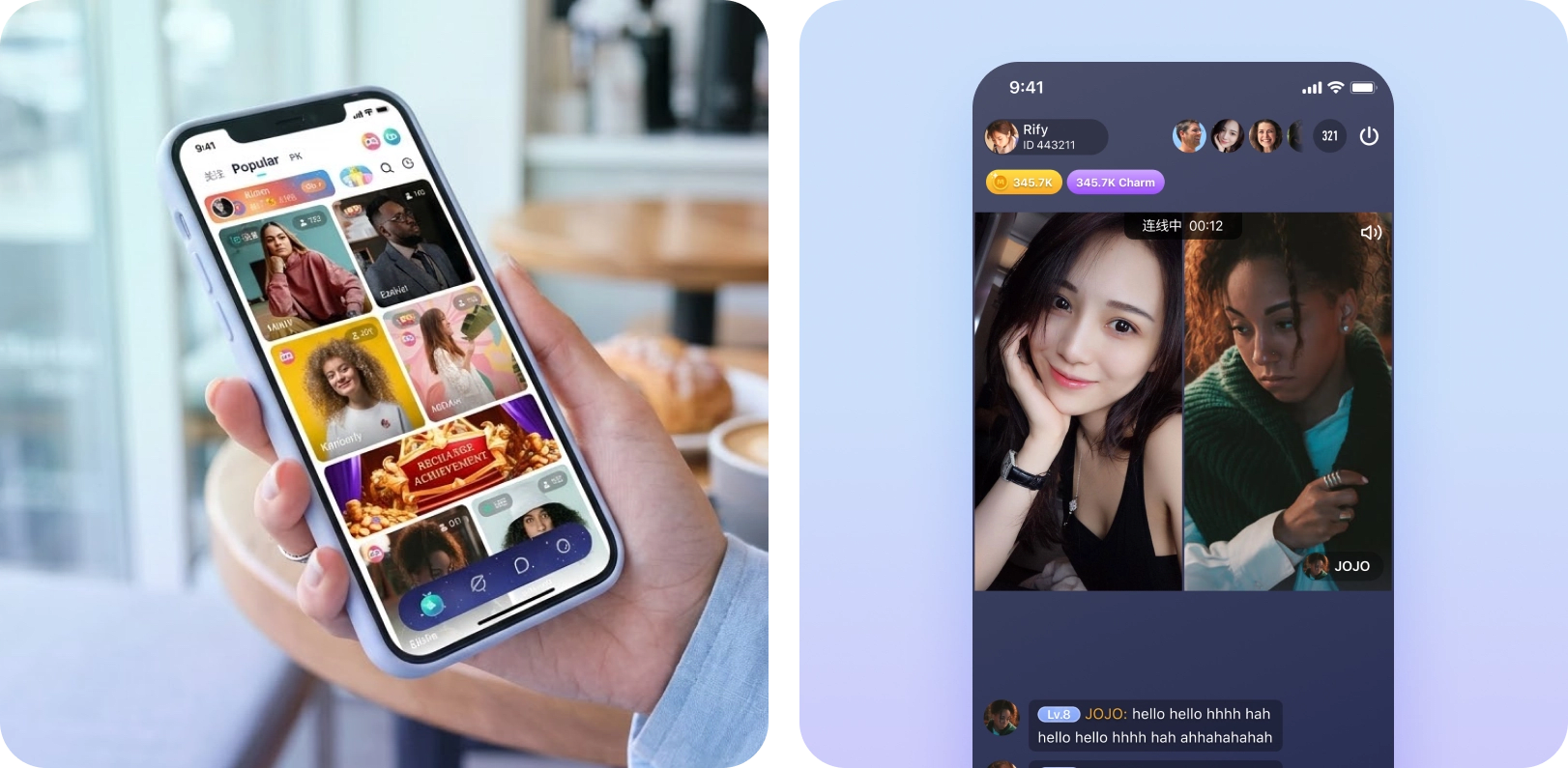
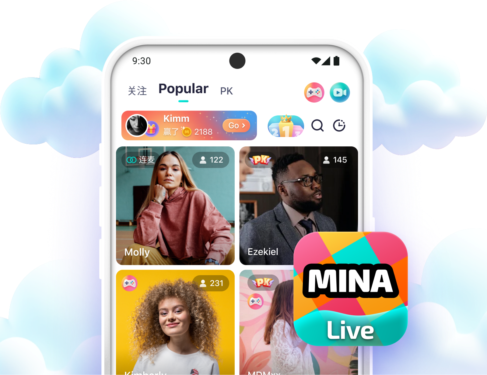
MinaLive Home Screen & Live Stream Room
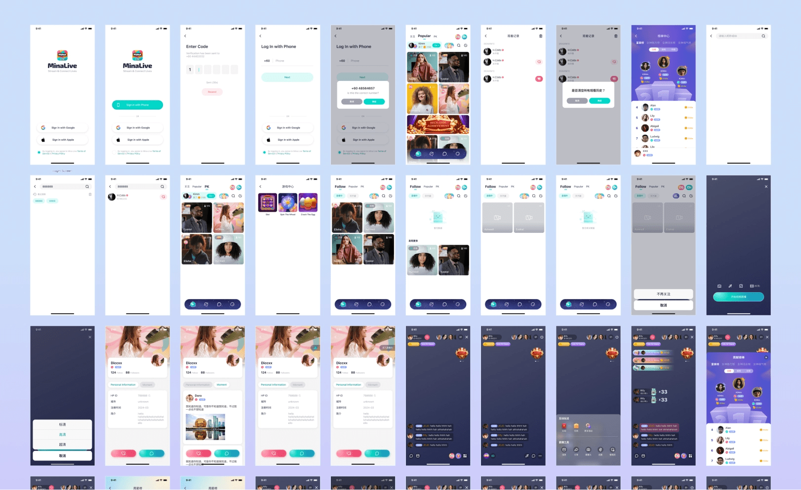
MinaLive Prototypes
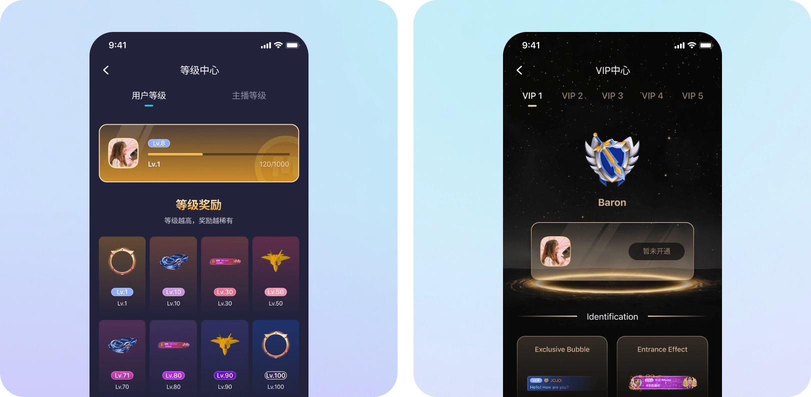
MinaLive VIP & Ranking Levels
Iteration
From Plain to Vibrant
An internal audit of the initial 'Ranking' and 'Games' screens revealed insufficient visual hierarchy. I iterated by adding high-contrast 'Weekly Star' modules and vibrant card visuals to boost competitive engagement.
Enhanced Dynamism
Colorful backgrounds and "card" containers for the Games screen.
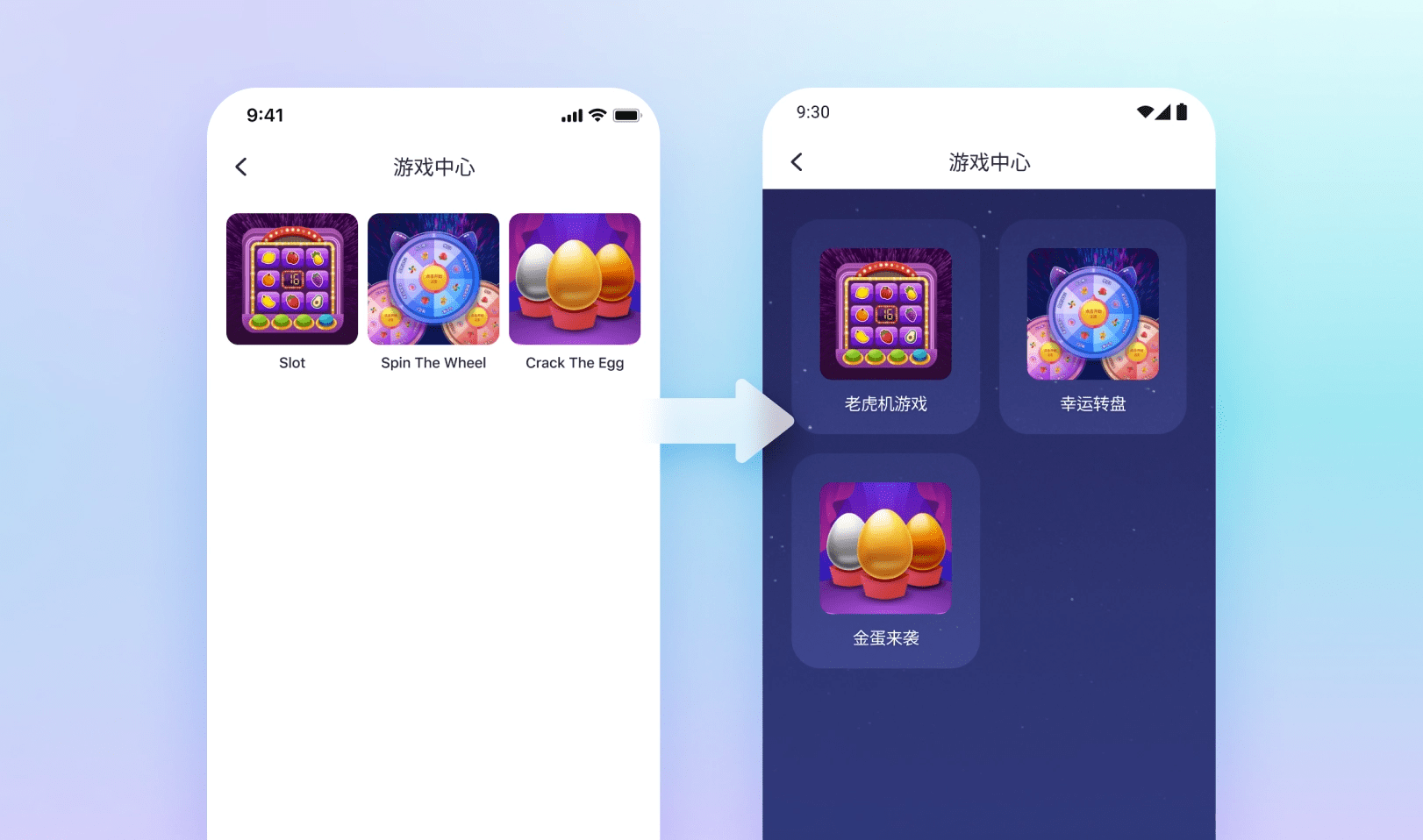
Old Game Screen vs. New Iteration
Gamification
Vibrant "Weekly Star" lists and attention-grabbing visuals to match local market trends.
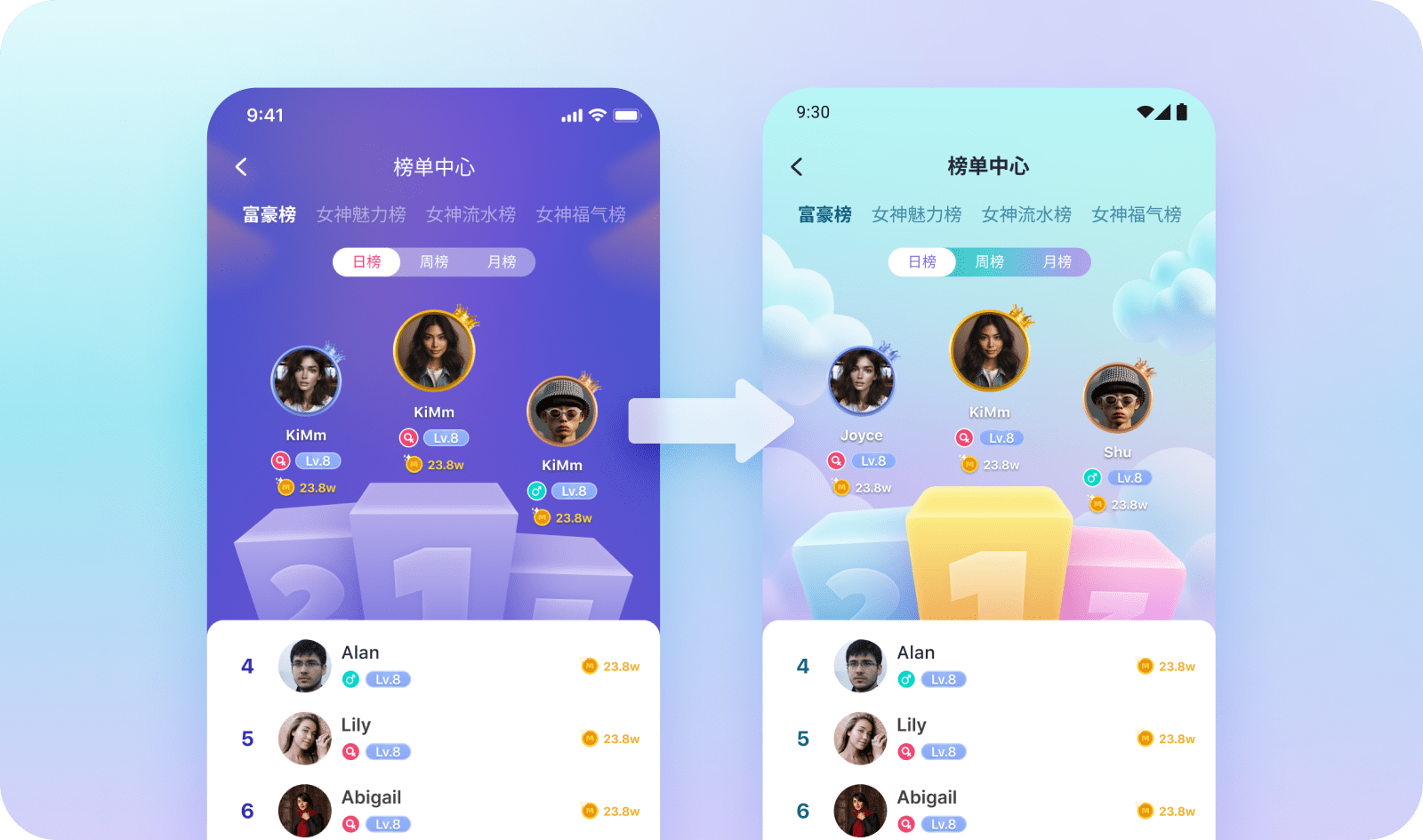
Old Ranking Screen vs. New Iteration
Outcome & Impact
Strategic Alignment & Delivery
I delivered a tailored design system and high-fidelity product spread in just 21 days. By front-loading the process with competitive benchmarking early on, I minimized late-stage revisions and finished the project a week before the internal deadline.
MinaLive Full Product Spread
Performance Projections
While the project concluded prior to public launch, the design architecture was engineered to address the "Cultural Friction" identified in initial research. The final UI was optimized for:
User Retention: Aim for a 20% boost in DAU (Daily Active Users) by incorporating engaging gamification strategies used by leaders like Huya and Bigo.
Session Depth: Projected 15% longer sessions with a localized "Moments" feed to enhance community interaction.
Development Efficiency: Implemented a Teal-based design system in Figma/Zeplin for complete design and production alignment.
Key Research Insight
This project validated that successful UX in the China market requires moving beyond "translation" and into Cultural Localization. By prioritizing vibrant aesthetics and reward systems over Western minimalism, the final product aligned with the specific mental models and social expectations of the target demographic.